


Introducing The New Logo!
on January 1, 2022
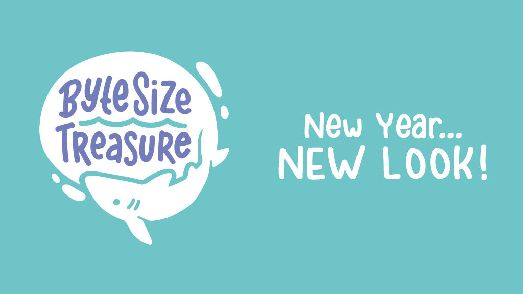
I'm super excited to announce the launch of the new Byte Size Treasure logo, color scheme, and handmade fonts! It's a completely new look for the shop, but I believe it better matches the vision I have for my business.

Why a new look?
My old branding has been in place since 2014, with only a few tweaks here and there. A redesign has been a goal of mine for a number of years, but I am my own worst critic when it comes to design, so nothing I was coming up with was working for me. With the way my business has evolved over the last year, I knew it was time to finally rebrand.

The new direction...
From the outset, I knew I wanted a new logo to better reflect my business - its values and its heart. With that, the life preserver began to feel too generic and didn't showcase what my shop stands for. Sharks have become pretty synonymous with my brand, so adding a shark was obvious.
Inspired by the wonderful world around us, the goal of Byte Size Treasure is to educate, foster appreciation, and emphasize the importance of ocean conservation. I do this by drawing cute & fun art - and I wanted a new logo & brand that reflected that.
I hope you like this new look for Byte Size Treasure!!